Using numbers to win your case
Trademark cases can stand or fall on survey data that demonstrates the likelihood of confusion and actual confusion – the crucial issue is not just what type of data is collected, but how it is presented.
There is an art to presenting evidence in any forum. This is especially true of statistical evidence, which is highly technical and can be difficult to understand. However, it does not have to be this way. Even the most complicated statistics can be presented in a clear, compelling manner. The most powerful way to present data is in a way that requires little or no explanation. Otherwise, people may think they are being tricked. Mark Twain is quoted as saying: “There are lies, damn lies and statistics.” People tend to have a similar belief when numbers are presented poorly. However, just as people have read and re-read Twain’s stories because they are so compelling, your fact finder will find your case compelling if your narrative is – especially when it is supported by strong statistical analysis. When the numbers are presented in such a way that people can tell the story themselves, they have a tendency to give those same statistics the weight of absolute truth.
For trademark cases, survey data demonstrating the likelihood of confusion and actual confusion is customarily presented through experts. The key to winning a case lies in how well that data is presented and the ease with which a layperson can understand it, as few people have the ability to analyse data themselves. Set out below is an example showing how poorly presented data had dire consequences and a re-presentation of that same data in a compelling, easy-to-understand way.
Space shuttle Challenger
Table 1: Reproduction of tables of data sent to NASA
Cross-sectional view |
Top view |
|||||||
52M No. |
Erosion depth (in) |
Perimeter affected (deg) |
Nominal dia (in) |
Length of max erosion (in) |
Total heat affected in length (in) |
Clocking location (deg) |
||
61A LW centre field** |
22A |
None |
None |
0.280 |
None |
None |
36-66 |
|
61A LH AFT field** |
22A |
None |
None |
0.280 |
None |
None |
388-18 |
|
51C LH forward field** |
15A |
0.010 |
154.0 |
0.280 |
4.25 |
5.25 |
163 |
|
51C RH centre field (prim)*** |
15B |
0.038 |
130.0 |
0.280 |
12.50 |
58.75 |
354 |
|
51C RH centre field (sec)*** |
None |
None |
45.0 |
0.280 |
None |
29.50 |
354 |
|
41D RH forward field |
13B |
0.28 |
110.0 |
0.280 |
3.00 |
None |
275 |
|
41C LH aft field* |
11A |
None |
None |
0.280 |
None |
None |
-- |
|
41B LH forward field |
10A |
0.040 |
217.0 |
0.280 |
3.00 |
14.50 |
351 |
|
STS-2 RH aft field |
2B |
0.053 |
116.0 |
0.280 |
-- |
-- |
90 |
|
*Hot gas path detected in putty. Indication of heat on 0-ring, but no damage.
**Soot behind primary 0-ring.
***Soot behind primary 0-ring, heat affected secondary 0-ring.
Clocking location of leak check part – 0 deg.
Other SRM-15 field joints had no blowholes in putty and no soot near or beyond the primary O-ring.
SRM-22 forward field joint had putty path to primary O-ring, but no O-ring erosion and no soot blowby. other srm-22 field joints had no blowholes in putty.
While not a trademark case, the example of the space shuttle Challenger is one of the most compelling examples of poorly presented data in history (Edward R Tufte, Visual Explanations: Images and Quantities, Evidence and Narrative, Graphics Press, 1997, Cheshire, Connecticut). Not only is it tragic, but it also shows that even rocket scientists can misinterpret data when it is not presented clearly and in an intuitive way.
One of the easiest ways to attack survey results is by showing that not all data was included
The space shuttle Challenger launched on January 28 1986 and broke apart 73 seconds after launch because a critical component – the O-rings – in the booster rocket failed. This failure was due to unusually cold temperatures the night before and at the time of launch. Tragically, the day before launch, the engineers at the company which manufactured the booster rockets recommended against proceeding with the launch. They were concerned that the O-rings might fail because the launch-day temperature forecast was only 29°F – the coldest-ever launch with their product by 24°F. The O-rings had eroded in previous cold-weather launches, but the erosion had been minor.
To convince the National Aeronautics and Space Administration (NASA) not to launch, the rocket scientists at the manufacturer sent 13 tables of data to the rocket scientists at NASA. However, none of these tables contained a clear, concise summary of the data; nor did they even frame the issue correctly.
This miscommunication between two sets of scientists led some extremely smart people to make the wrong decision. These same scientists would likely have decided not to launch had the evidence been presented correctly.
One of the tables of data sent to NASA that day is reproduced in Table 1 below. At a glance, this table is indecipherable. It contains raw, unsorted data with no framework and minimal analysis. The only analysis provided is in the notes underneath the table, and even they do not help interpret the data. For example, neither the chart nor the notes includes any information on the temperature at which those launches occurred. If that were included, it could be summarised in Table 2.
13
Tables of data sent to NASA, with none containing a clear, concise summary of the data required for proper decision making
Table 2 is exactly the information that the NASA scientists gleaned. Based on this data, the manufacturer’s engineers recommended that launches should occur at temperatures greater than 53°F. However, when the rocket scientists at NASA looked at the chart, they reached a different conclusion: that, based on these two data points, failure happened on the coldest day and the hottest day of launch (Vaughn, Challenger Launch Decision, pp 296-7). In other words, the information provided no meaningful information.
Before the launch of Challenger, there had been 24 shuttle launches. However, the data presented was for only two launches. If the manufacturer’s engineers had presented all of the information in their possession in a clear way, the picture would have looked very different to the NASA scientists. During the 24 space shuttle launches to date, there had been multiple launches with O-ring erosion that did not rise to the level of O-ring failure. However, this additional O-ring erosion data was not included. If all data had been included and paired with the temperatures at launch, the manufacturer’s argument would have crystallised, as in Table 3.
Further, if the manufacturer’s engineers had performed the same analysis on all of its data, they may have changed their recommendation for launch temperature to 70°F. The data would have appeared as in Table 4.
Even so, summary tables, while clear and understandable, are less compelling than a visual summary that requires little analysis. A graphical representation presents the data in such a way that the conclusions can be intuited by those viewing it, almost without explanation.
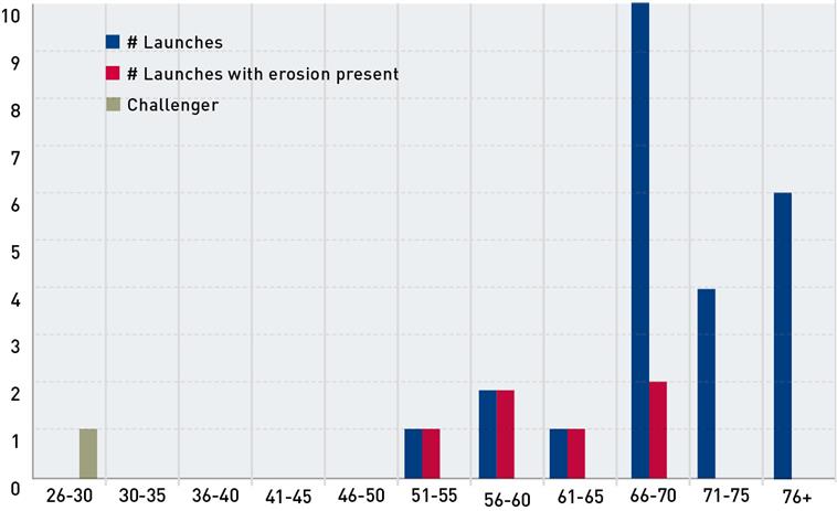
Something as simple as graphing the number of launches versus temperature, including how many had O-ring erosion, would have negated the need for any explanation or interpretation (as illustrated in Figure 1 overleaf). The story is a simple yet compelling one that can be told by the data itself. All of the launches below 66°F demonstrated O-ring erosion, while none of those over 70°F did. It also §summarises the story of Challenger itself. It was to be launched at the coldest temperature in space shuttle history: 29°F, almost 25° lower than the coldest launch to date. If a chart such as this had been coupled with the recommendation not to proceed with the launch, the point would have been clear to all decision makers involved. The failure to present and interpret all of the data that was readily available resulted in the preventable loss of Challenger and its crew.
Presenting data from trademark surveys
While the Challenger example is tragic, it underscores the power of including the right data and presenting it clearly and intuitively. By following these five steps, you can ensure that you adequately represent the relevant data and present it successfully.
Making charts and graphs overly fancy, colourful or in three dimensions can make them less accessible to the intended audience and distract from the message
Table 2: Temperature at launch
SRM field joint number |
# O-rings with erosion |
Temperature |
15 |
3 |
53°F |
22 |
2 |
75°F |
Table 3: Combined o-ring data/temperature
Percentage of launches with O-ring erosion |
Number of launches with O-ring erosion |
Temperature |
100% |
1/1 |
|
21% |
5/23 |
>53°F |
Table 4: Launch recommendation data
Percentage of launches with O-ring erosion |
Number of launches with O-ring erosion |
Temperature |
42% |
6/14 |
|
0% |
0/10 |
>70°F |
Put the data into context by selecting the appropriate universe
One of the most common problems with statistical survey evidence in trademark cases is identifying the wrong universe from which to draw a sample (see Waterpik, Inc v Medsystems, Inc, 726 F 3d 1136 (10th Cir 2013) (striking expert report because of failure to properly select population universe, among other errors); Scott Fetzer Co v House of Vacuums, Inc 381 F 3d 477, 487-88 (5th Cir 2004) (same)). For forward confusion, the universe should include people likely to buy the infringer’s product; while for reverse confusion, it should include those who have already purchased the product. In addition, the universe must be well tailored to the types of consumer of the products at issue. For example, the products at issue in Waterpik were sinus irrigation products. While the expert in Waterpik identified a universe of potential customers as all those who purchase sinus remedies, only 1% of that population use nasal irrigation. Therefore, the universe was overly broad (Waterpik, 726 F 3d at 1145).
In the Challenger example, the reverse was true. The universe identified by the manufacturer’s engineers was far too narrow. It contained data from only two launches and only one was a cold-weather launch. However, the data available included 24 launches, six of which experienced O-ring erosion. Therefore, the two data points that were the subject of discussion had no context, which led the NASA scientists to conclude that the data was essentially meaningless because O-ring failures occurred on the coldest and hottest days. Also, the manufacturer’s engineers did not point out the absence of a universe: there had been no shuttle launches at temperatures below 53°F and therefore the proposed launch at 29°F would be unprecedented.
Moreover, in some cases, the universe has been misidentified completely. A famous example of this is Amstar Corp v Domino’s Pizza, Inc, where the maker of Domino’s sugar challenged the use of the name Domino’s Pizza. To demonstrate likelihood of confusion, Amstar’s survey used a universe consisting entirely of women who were home during daylight hours and were the primary grocery shopper in the household. By contrast, the target market for Domino’s Pizza was college-aged males. The Amstar survey was also performed in only two cities that had a Domino’s Pizza, while the remaining eight cities surveyed did not. For these reasons the court concluded that the survey evidence did not include the target consumers.
Figure 1: O-ring erosion versus temperature
Select a representative sample
Once the correct universe has been identified, selecting a representative sample is critical because it is not possible to survey everyone in the identified universe. As long as the proportions remain the same and the universe is correct, the sampling has been carried out successfully.
This is also the step where some errors in identification of the universe can be corrected. For example, in Waterpik the expert collected data across broad age demographics, but included too many people over age 55. The universe consisted of 29% of people in that age group, while the sample consisted of 42% of people in that age group. Before the data analysis is performed, the proportion of people in each category can be weighted to reflect the universe, so that the proportion of people in each category remains the same as that in the universe. For example, assume that in the above football survey, two National Football League (NFL) players were in the sample instead of one, and they were asked a yes/no question.Customarily, a ‘yes’ is categorised as a one for data purposes and a ‘no’ is zero. Rather than disregard one of the players’ answers (likely that least favourable to the case), to keep the sample proportion of NFL players to total players aligned with the corresponding universe proportion, a ‘yes’ player is given a weighted answer of 0.5. So if they both say yes, the numerical value given will be one. This will be the same as if only one player were surveyed. However, if one said yes and the other no, the numerical value will be 0.5. Once this is analysed with the rest of the data, the analysis will be proportional and the sample correct.
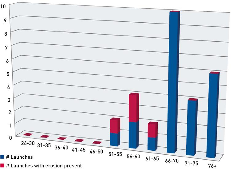
Figure 2: Poor presentation of 0-ring versus temperature
Present all of the data
One of the easiest ways to attack survey results is by showing that not all data was included. Once demonstrated, this immediately creates a perception that, when viewed as a whole, the data is contrary to what it is being presented for (eg, eliminating the answer of one of the NFL players in the example above). The audience will think that the presenter is trying to trick them, as Twain suggested. This is why using weighted data, as discussed above, is critical in obtaining the trust of the intended audience. If some of the data is not used (eg, values that are clearly erroneous, such as an answer of 40 on a scale of one to 10), present that data and explain why it is being excluded from the analysis. Otherwise, the audience understands that they do not have the complete picture and will spend more time focusing on what was not presented rather than what was.
Present the data in context
Presenting the data in context is also key to telling the story. Providing background information will help the audience to understand what the data means and why it supports the narrative you are telling so powerfully. This background information will give the audience a foundation onto which they can add the survey information.
Another key foundational building block is the reference or control group. This is often overlooked or misused when gathering survey evidence. For example, there is no way to answer the question ‘Is he tall?’ without some reference to which ‘he’ can be compared – such as another person or the average height. Presenting a relative measure in a vacuum is meaningless.
The Waterpik case again provides a good example of what not to do. There, the issue was whether the trademark SINUCLEANSE was confusingly similar to the trademark SINUSENSE. The expert asked questions aimed at determining whether consumers confused these two products.
He also asked questions about whether consumers confused these two products with a reference product, NeilMed. Therefore, the expert did collect data with reference to the correct control group. However, he did not use the control group data correctly: he made the mistake of misusing the reference information in his analysis by not subtracting that baseline information for both groups before making his comparisons.
Presenting data in the proper context also includes using the right labels for the data, charts and graphs. In the Challenger example, the chart sent to NASA was titled, “History of O-Ring Damage on SRM Field Joints”. However, this was not a complete history of O-ring damage. It did not include data about all of the launches in which damage occurred; nor did it include data on launches in which no damage occurred. Yet the title of the table could easily mislead readers to think that this was the only data available.
Table 5: Poor presentation of 0-ring versus temperature
# Launches w/no erosion |
# Launches w/erosion present |
|
26-30 |
0 |
0 |
31-35 |
0 |
0 |
36-40 |
0 |
0 |
41-45 |
0 |
0 |
46-50 |
0 |
0 |
51-55 |
1 |
1 |
56-60 |
2 |
2 |
61-65 |
1 |
1 |
66-70 |
8 |
2 |
71-75 |
4 |
0 |
76+ |
6 |
0 |
Present results simply and clearly
As shown in the Challenger example, presenting data in a clear and simple way is the most important part of a presentation. The survey universe may be perfect and the survey sample precise, but if the intended audience cannot understand the results, it is worthless. Simplicity is the key. Making charts and graphs overly fancy, colourful or in three dimensions can make them less accessible to the intended audience and distract from the message. Figure 2 and Table 5 (both opposite) are examples of poorly presented data using the data from the Challenger example above.
These presentations, while aesthetically pleasing, do not evoke the intuitive understanding presented in the Challenger graph discussed previously. That graph generally evokes the same response from all who view it: what was NASA thinking when it decided to launch? It requires no explanation, sets the problem up clearly and shows the likely result all in one simple, easy-to-understand graph.
It does not matter how wonderful the data is or how pretty the presentation is if it is confusing or non-intuitive. The best presentation of data requires little or no explanation, and allows for the viewer to draw his or her own conclusion. Presenting everything simply and clearly will add great weight to the credibility of the data and the witness.

Michelle Mancino Marsh
Arent Fox LLP